top of page

Lead UX Researcher
Role:
6 weeks
Duration:
Tools:
MS Word, MS Excel, Zoom, FIgJam, Figma, Chatgpt
Contributions:
Collaborated with the team to align the research process with client needs.
Devised a strategic plan and executed research according to the test protocol.
Conducted various research methods to identify key usability issues
Calculated and interpreted SUS scores to measure the usability of the website.
Created detailed design recommendations to tackle identified issues.
ABOUT THE PROJECT
Client Context
The IUPUI Wellness Coalition is dedicated to monitoring and enhancing the health and overall wellness of IUPUI students. Their website emphasizes seven key student objectives, which guide their efforts to make meaningful progress in their goal.

Streamlining Navigation and Enhancing User Engagement of the Website for Improved Usability and Clarity for Students and Faculty
Project Background
The IUPUI Wellness Coalition website serves as a comprehensive platform displaying extensive data on student health and wellbeing. However, the website's presentation of this large volume of data has led to usability issues. Users often find the website overwhelming at first glance, leading to increased reading time, user frustration, annoyance or confusion as they struggle to comprehend the content quickly.
This highlights the need for redesigning the website to make it more user-friendly, ensuring that information is easily accessible and understandable, thereby enhancing the user experience
“How can we revisualize the website to streamline the presentation of extensive student data, ensuring user-friendly access, understanding, and engagement while enhancing overall user experience?”
About Project
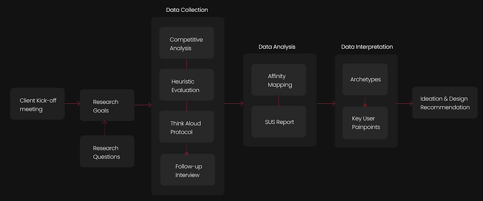
UX WORKFLOW MAP
How did we come up with the design recommendation ?
.png)
THE FIRST STEP
RESEARCH GOALS
Navigating the Unknown
What is the direction of our research?
Goal 01
To identify and mitigate issues that users, specifically students and prospective students, face when tracking and comparing health and wellness data.
Goal 01
To determine the most effective ways to present and organize data on the website to improve user understanding and readability.
Goal 01
To ensure the website’s structure and content organization aligns closely with user expectations and supports their goals effectively.
Began determining and exploring these research questions that steered our research process
.png)
What issues do students and faculty face when tracking and comparing info on the website?
How well the website does in terms of user experience?
How do users feel about the time and steps it takes to find what they need on the dashboard?
Does the layout and flow of the website meet what users expect?
How does the layout and organization of the website make the data easier or harder to read?
Can users easily understand the information on the website?
CURATING THE INFORMATION
MARKET RESEARCH
Analyzing the Market
Who are the primary competitors, where does IUPUI stands with industry standards and why?
.png)

Finding 01
Need for effective categorization
of data to optimize information display
Finding 02
Need to display content precisely under
sections to prevent information overload.
Finding 03
Need for graphical and interactive
elements to increase ease of use
.png)
.png)
.png)
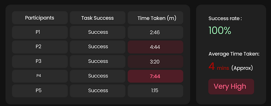
Effectiveness
Efficiency
HEURISTIC EVALUATION
Inspecting the Functionality
How does the interface measure up against usability principles in design and functionality?
.png)
THINK ALOUD PROTOCOL
Getting to Know User’s Perspectives
How do users engage with product and What do users have to say about it?
Summary of the think aloud session
5
Research Study
Participants
Users:
IUPUI Students
Type:
Novice and Expert Users
Goal:
To identify the key challenges faced by users during their product interaction and to gather detailed user feedback.
5-10
Overall Duration in minutes
Given Tasks:
Task 1 : The users had to go through the student objectives mentioned on the IUPUI Coalition Dashboard.
Task 2 : Select one of the objectives to read and tell us what did they understand after reading the data regarding it.
Quotes from the session
.png)
An internation graduate student
“I have to scroll more and the website isn’t motivating”
.png)
A graduate
student
“I am just getting the gist of the it and not hard core info.”
.png)
An undergraduate
student
“There should be some back-up data for the information”
Deriving Insights from the Data
.png)
SUS REPORT
Measuring the Usability
What is the perceived usability of the website?
5
Research Study
Participants
Users:
IUPUI Students
Type:
Novice and Expert Users
Goal:
To calculate usability score through website interaction rating and assess the website’s user experience.
5-10
Overall Duration in minutes
54
Average SUS
Score
D
Grade of the score obtained

We can be 80% confident that the population's true SUS score lies between 65.4 and 50.1

THEMATIC ANALYSIS
Uncovering Common Patterns
What is the most prevalent insight recurring in the research outcomes?
We categorised the data from all research outcomes based on recurring themes and are as follows:.
Information
Overloading
Frustration
Incomprehensible
Lack User
Engagement
Time Consuming
Confusion

ARCHETYPES
Illustrating the User Base and their story
Who are our users and What are their key painpoints?

The Engaged
Student
"I love how the wellness website keeps me in the loop with the latest mental health workshops and fitness challenges, it's like my go-to guide but the website is so cluttered that sometimes it takes forever to find what I need."

The Curious
Visitor
"Exploring the wellness website gave me a real sense of how seriously this campus takes student health and wellbeing. However, I was looking for information about mental health, the site is overwhelming that it’s hard to find clear answers quickly."

The Research
Scholar
"The website’s comprehensive data on student health initiatives is invaluable for my research on campus wellness trends but poor presentation of information makes comparative analysis frustrating and a hassle."
PROBLEM STATEMENT
The Question of the Hour
“How might we revisualize the website to streamline the presentation of extensive student data, ensuring user-friendly access, understanding, and engagement while enhancing overall user experience?”
IMPLEMENTING INFORMATION
DESIGN RECOMMENDATIONS
Tackling Challenges One Step at a Time
Challenge 01
All the Information in one single screen leads to longer scrolling resulting in information overloading.

Recommendation 01
Categorize information of each objective type under sections for quick access, minimizing scrolling and enabling data retrieval within a click.

Challenge 02
With every information in one stretch users cannot keep track of the various data causing cognitive strain.

Recommendation 02
Simplify website's navigation by using search and filters options on the website to enable users to efficiently retrieve desired information

Challenge 03
Too much verbal information to read and no visual representation of any data leads to content saturation.

Recommendation 03
Enhance data comprehension and readability
by employing graphical data representation allowing the content to be viewed at a glance

Challenge 04
Data report can be accessed by selecting hyperlinks which is not easily understandable by novice users.

Recommendation 04
Simplify the hyperlink with layman’s term, or provide a tooltip that explains the link's purpose when users hover over it.

TAKING HOME
SELF REFLECTION
Transforming Experience into Wisdom
Learning 01
Developed clearer communication strategies to convey complex data insights to non-technical stakeholders.
Learning 02
Learned to manage expectations and foster collaborative relationships with a team of diverse background.
Learning 03
Enhanced my ability to identify core usability issues based on analyzed data and and ideate creative solutions effectively.
Learning 04
Refined my critical thinking skills to evaluate the effectiveness of design choices against user data and research findings.
bottom of page